In this article
- 1. Warm Off-White for a Soft, Bright Foundation
- 2. Pale Beige for an Easy, Warm Atmosphere
- 3. Light Greige for a Modern Neutral Look
- 4. Muted Sage Green for a Subtle Natural Accent
- 5. Dusty Blue for a Calm, Cooler Palette
- 6. Dusty Blush for a Little Warmth
- 7. Cream and Taupe for Gentle Contrast
- 8. A Deeper Bed Wall for Controlled Contrast
- 9. Muted Olive for Earthy Depth
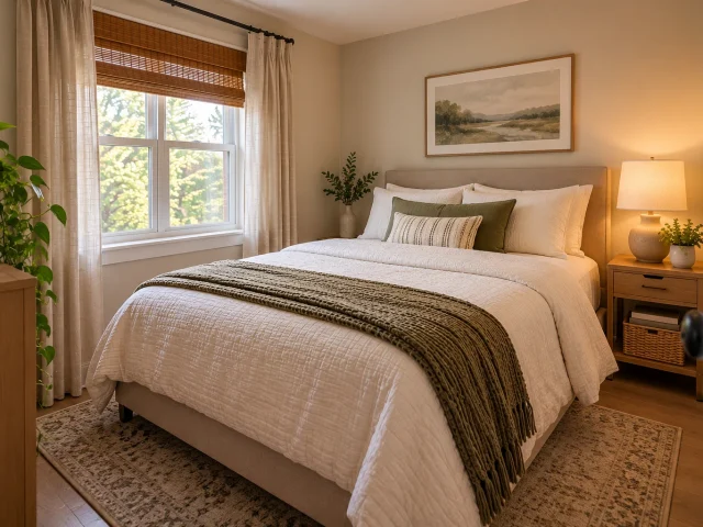
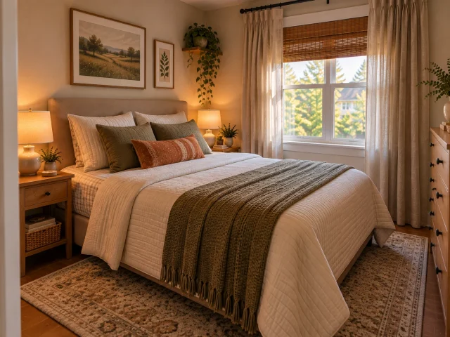
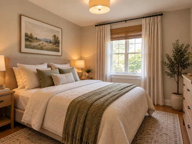
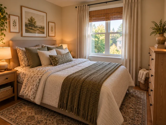
- 10. Keep Walls Neutral and Let Bedding Carry the Color
- 11. Choose Curtains That Connect With the Walls
- 12. Use Two Related Wall Colors
- 13. Use Natural Wood to Warm Up Neutral Walls
- 14. Dusty Terracotta for an Earthy Accent
- 15. A Dark Palette That Feels Deliberate
- 16. A Monochromatic Palette With More Texture
- 17. Let Artwork Introduce a Color Combination
- 18. Test Paint Against the Room’s Actual Light
- 19. Build a Simple Three-Color Palette
- How to Choose a Color for Your Small Bedroom
- Small Bedroom Color Mistakes to Avoid
- Final Thoughts
19 Small Bedroom Color Ideas That Make a Room Feel More Open
Choosing a color for a small bedroom is not always as simple as picking the palest shade on a paint chart. A cool white can look crisp in one room and stark in another, while a deeper color may feel cozy rather than cramped when it works with the lighting and furniture.
The aim is to create a room that feels comfortable, connected, and visually balanced—not to make every wall disappear.
Warm neutrals, muted greens, dusty blues, and carefully placed accent colors can all work in a compact bedroom. The difference often comes down to undertones, natural light, and how the wall color relates to bedding, curtains, flooring, and furniture.
Here are 19 small bedroom color ideas, along with practical ways to use each palette without making the room feel overly busy.
1. Warm Off-White for a Soft, Bright Foundation
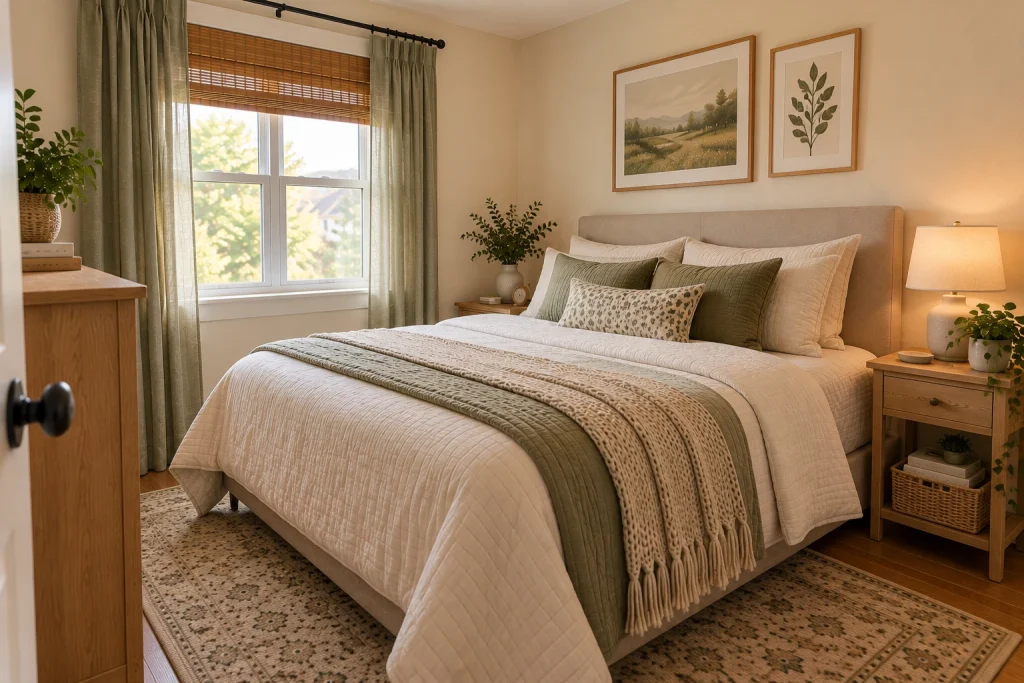
Warm off-white gives a small bedroom brightness without the sharp contrast of a very crisp white.
Look for subtle cream or beige undertones. These can sit comfortably beside natural wood, ivory bedding, woven textures, and soft brown accents.
Use the shade across the main walls, then introduce a little contrast through the bed frame or nightstand. The room stays light, but the furniture does not disappear into the background.
Color combination: Warm off-white, natural oak, ivory, and muted tan.
2. Pale Beige for an Easy, Warm Atmosphere
Beige is useful when a bedroom feels too cool or plain but does not need a dramatic color change.
A pale, balanced beige can create a welcoming backdrop for white bedding, wood furniture, and understated artwork. Pay attention to its undertone: a strongly yellow beige may look much warmer across four walls than it does on a small sample.
Rather than matching every textile exactly, combine a few related shades—perhaps beige walls, cream bedding, and a deeper taupe throw.
That small variation helps the room feel layered instead of flat.
3. Light Greige for a Modern Neutral Look
Greige sits between gray and beige, making it a practical option when you want a contemporary palette that still has warmth.
Pair pale greige walls with white bedding, light oak, and a few dark details such as a lamp base or picture frame.
Its appearance can shift with the light. A room with cool daylight may bring out the gray, while warmer bulbs can emphasize the beige.
Before painting, test the shade beside your actual flooring and furniture. A neutral that looks appealing on its own may not be the right match for the materials already in the room.
4. Muted Sage Green for a Subtle Natural Accent
Sage green introduces color without demanding attention.
Choose a softened, gray-green shade rather than a bright or highly saturated green. It pairs naturally with cream, warm white, pale wood, and linen-like fabrics.
You can use sage across the room for a cohesive look or limit it to the bed wall if you prefer a quieter change.
Keep the larger furniture finishes simple. A restrained palette allows the wall color to contribute to the room’s atmosphere without competing with every other element.
5. Dusty Blue for a Calm, Cooler Palette
Dusty blue is a gentle alternative to beige when you want a little more color.
A muted blue with gray undertones can work with white bedding, pale wood, warm beige, and simple black accents. It offers a cooler appearance without the intensity of a saturated blue.
In a bedroom with limited daylight, test it carefully. Some blue-gray shades may look noticeably cooler or darker once they cover a full wall.
Warm bedside lighting and soft textiles can help balance the palette in the evening.
6. Dusty Blush for a Little Warmth
Blush does not have to mean a bright pink bedroom.
Muted rose, pale clay-pink, and dusty blush can bring warmth while remaining understated. They work particularly well with cream, taupe, light oak, and simple metal finishes.
If painting the whole room feels like too much, start with the bed wall or introduce the shade through a quilt, cushions, or curtains.
This is an easy way to see how the color behaves beside your existing furniture before making a permanent change.
7. Cream and Taupe for Gentle Contrast
Cream and taupe create definition without relying on a strong color difference.
Use cream as the lighter foundation and taupe for selected elements such as the headboard, curtains, or bedding. A slightly deeper taupe on the bed wall can also give the room a clear focal point.
The important part is keeping the undertones compatible. Too many unrelated browns and grays can make a small room feel visually disconnected.
Choose a few shades and repeat them intentionally.
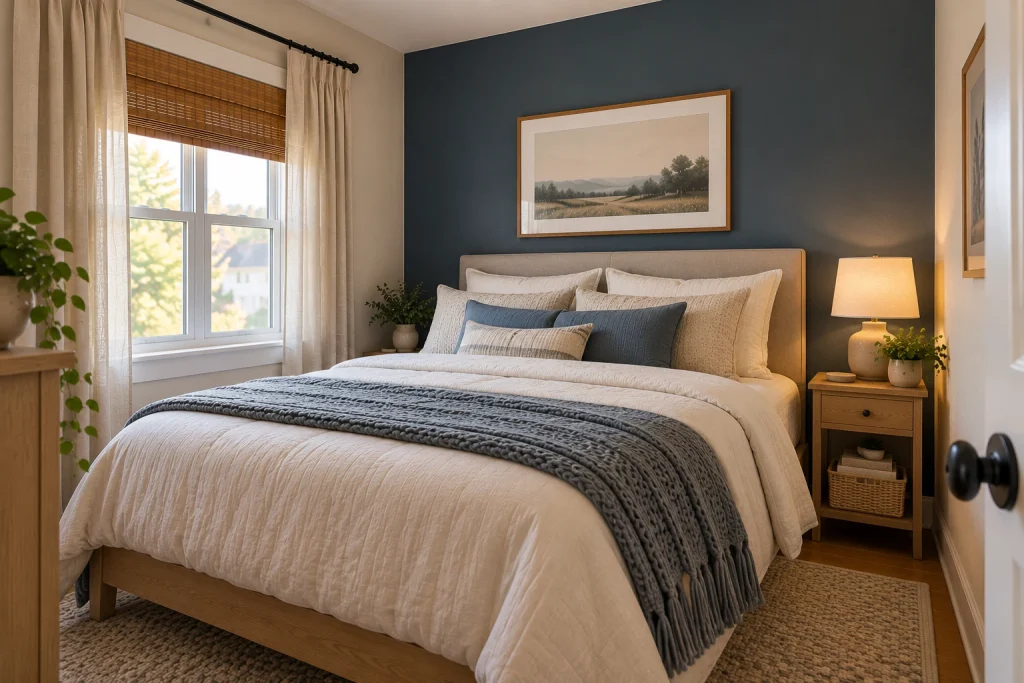
8. A Deeper Bed Wall for Controlled Contrast
A deeper color behind the bed can add character without spreading a strong shade across every wall.
Consider smoky blue, muted olive, deep taupe, or softened charcoal. The bed already gives this wall a natural purpose, so the color can feel deliberate rather than random.
Keep the remaining walls lighter if you want the contrast to stay contained.
An accent wall is not a guaranteed way to make a bedroom look larger. Its value is in creating a clear visual focal point and a palette that suits the room.
9. Muted Olive for Earthy Depth
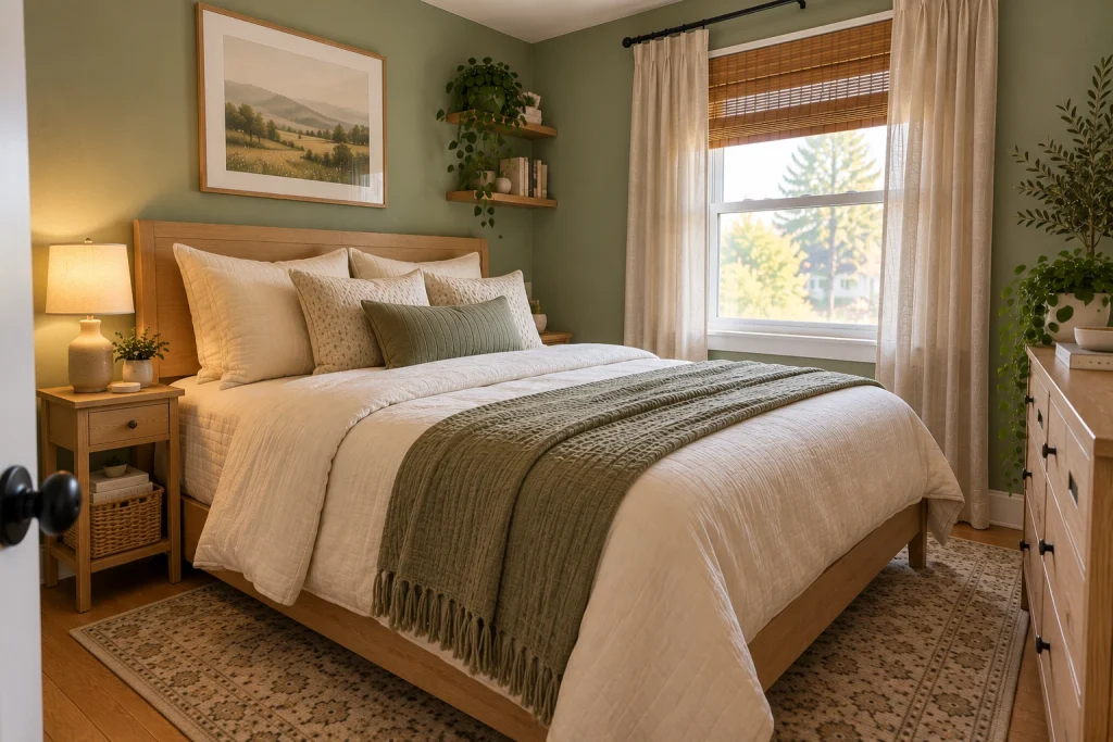
Olive green brings more depth than sage while remaining connected to a natural palette.
It can work with warm white, cream, walnut, and simple black details. In a particularly compact bedroom, try olive on one wall or through bedding before committing to a larger painted area.
If you like the shade across the whole room, consider how the existing light and furniture will support it.
A darker color can be a deliberate design choice; it does not have to be treated as a mistake simply because the room is small.
10. Keep Walls Neutral and Let Bedding Carry the Color
When choosing paint feels uncertain, bedding is a useful place to experiment.
A duvet cover, quilt, or throw can introduce sage, dusty blue, muted terracotta, or a subtle pattern against neutral walls.
This approach is especially practical for renters. If you’re looking for more flexible decorating options, explore these small bedroom ideas for renters.
It also makes color testing easier. If a shade feels too strong after a few days, changing the bedding is much simpler than repainting.
11. Choose Curtains That Connect With the Walls
Curtains can either blend into the room or provide a gentle contrast.
For a continuous look, choose a shade close to the wall color. Warm white walls with oatmeal curtains, pale sage with cream, or greige with soft taupe are examples of related combinations.
Fabric matters as much as color. Consider the curtain’s weight, texture, and how it frames the window.
A very dark or heavy treatment may dominate a small window, while a lighter fabric can keep the overall composition softer.
12. Use Two Related Wall Colors
A two-color wall scheme can create definition without a dramatic contrast.
One option is a light neutral on most walls and a slightly deeper version of that color behind the bed. Another is a lower painted section with a lighter upper wall.
Before choosing a dividing line, consider the ceiling height, trim, and window placement. A split that is poorly aligned with the room’s features may look distracting.
Keep the colors related and let the architecture guide the placement.
13. Use Natural Wood to Warm Up Neutral Walls
Paint is only one part of a bedroom’s color palette.
Natural wood can add warmth to off-white, cream, or pale greige walls without introducing another strong paint color.
A light oak bed frame, for example, can be repeated in a bedside table or a small decorative detail. Avoid mixing too many unrelated wood finishes unless the contrast is intentional.
The result can feel considered and welcoming while keeping the number of colors manageable.
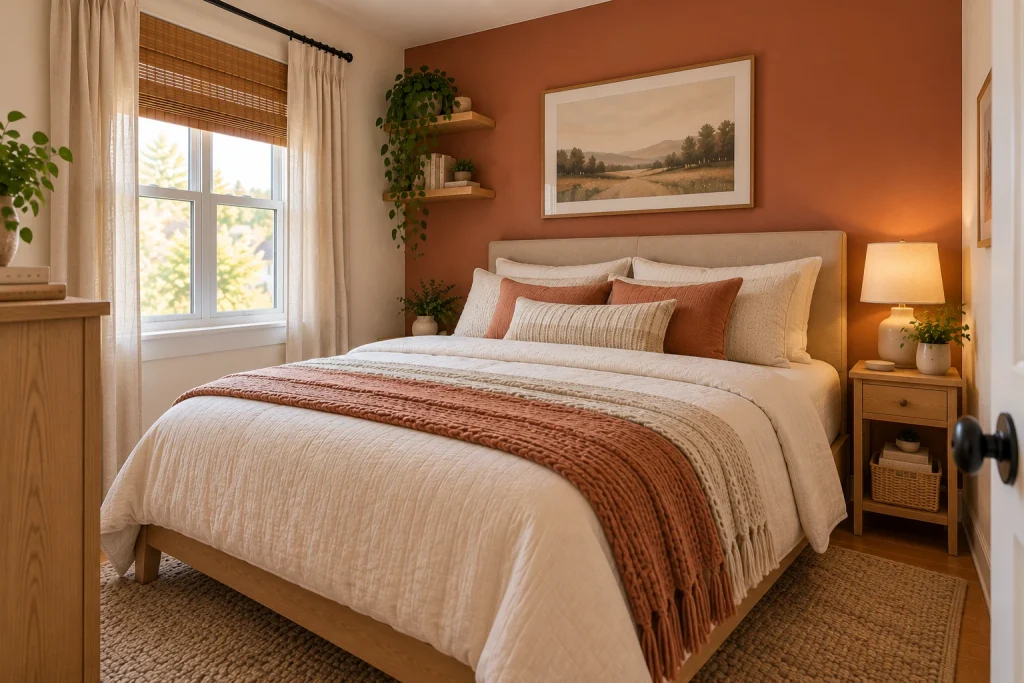
14. Dusty Terracotta for an Earthy Accent
Terracotta brings warmth and personality, especially when softened into clay, muted rust, or dusty earth tones.
For a small bedroom, introduce it through a throw, cushions, artwork, or a limited accent wall. Pair it with cream, warm white, beige, or natural wood.
If you choose a terracotta wall, keep nearby decor relatively restrained. The color should have a clear role rather than compete with several other strong accents.
15. A Dark Palette That Feels Deliberate
Deep navy, charcoal, forest green, and rich brown can all have a place in a small bedroom.
Rather than assuming dark paint is unsuitable, consider what atmosphere you want and how the room is lit. A deeper palette may feel enveloping and intimate, even if it does not create the bright impression of a pale one.
If you’re experimenting with a darker palette, thoughtful lighting can help balance the room. See these small bedroom lighting ideas for practical ways to approach bedside and ambient light.
If you are unsure, begin with the bed wall. Add layered lighting and some lighter bedding or textiles to create variation.
The goal is not to follow a rule about light versus dark. It is to choose a combination you will enjoy living with.
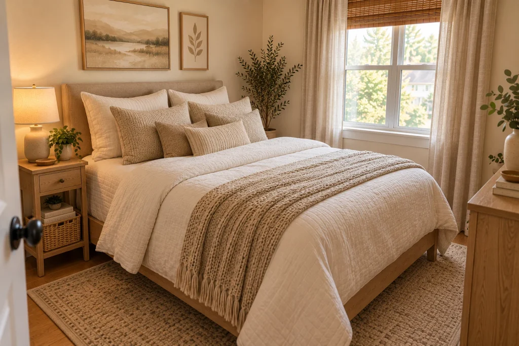
16. A Monochromatic Palette With More Texture
A monochromatic bedroom uses several shades from one color family.
For example, warm white walls can sit alongside ivory bedding, cream curtains, and a beige throw. The colors remain related, while texture keeps the room from feeling one-dimensional.
Mix smooth cotton, woven fabric, wood grain, and a soft rug. These material differences can provide visual interest without requiring more colors or decorative objects.
For more ways to bring together the finishing details, explore these small bedroom decor ideas.
This approach is useful when you want the room to feel calm and cohesive.
17. Let Artwork Introduce a Color Combination
Artwork can bring a new color into the bedroom without changing the walls.
Choose a piece that repeats tones already present in the room. A print with muted blue, beige, and warm white, for example, can connect the bedding with the wall color.
Pay attention to scale. One appropriately sized piece may feel more settled than several small frames with unrelated colors.
The frame and placement should also relate to the bed and surrounding furniture.
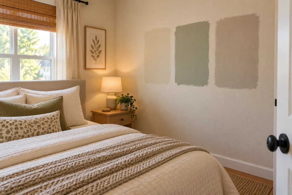
18. Test Paint Against the Room’s Actual Light
A paint color can look different depending on daylight, artificial lighting, nearby surfaces, and the direction a window faces.
Instead of choosing from a small paint chip alone, place sample patches on more than one wall. Check them in the morning, afternoon, and evening, including under the lights you normally use.
Look at the samples beside your bedding, flooring, and furniture too.
This simple step can help you avoid choosing a shade that looks attractive in isolation but feels wrong once the room comes together.
19. Build a Simple Three-Color Palette
When several colors appeal to you, give each one a role:
- Base: The main wall or largest surface color.
- Supporting shade: A color repeated in bedding, curtains, or furniture.
- Accent: A smaller amount used in artwork, cushions, or accessories.
For example, warm off-white can be the base, muted sage the supporting shade, and natural wood a repeated material accent.
Another combination is pale greige, dusty blue, and warm oak.
This is a planning tool, not a strict decorating rule. Its purpose is to make choices easier and help the room feel connected.
How to Choose a Color for Your Small Bedroom
Before buying paint, consider the room as a whole:
- Natural light: Does the room receive strong daylight, indirect light, or very little sun?
- Existing finishes: How will the color look beside the bed frame, floor, and wardrobe?
- Desired mood: Do you prefer a warm, relaxed look or a cooler, contemporary one?
- Large surfaces: Will the walls coordinate with bedding, curtains, and rugs?
- Flexibility: Would you rather paint or introduce color through easier-to-change items?
Color selection is only one part of making a compact bedroom work. Consider how the bed, furniture, and available floor space fit together with these small bedroom layout ideas.
If you are choosing between two similar shades, test both in the room before making a decision.
Small Bedroom Color Mistakes to Avoid
A few common choices can make the process harder:
- Choosing paint from a tiny sample without testing it on the wall.
- Mixing warm and cool undertones without a clear connection.
- Adding several strong accent colors that compete for attention.
- Assuming every small bedroom must be white.
- Selecting curtains and bedding without considering the wall color.
- Choosing a darker paint without considering the room’s lighting.
- Painting before checking the shade beside the flooring and furniture.
A successful palette does not need to be complicated. A few compatible colors, repeated thoughtfully, can make the bedroom feel more complete.
Final Thoughts
The most useful small bedroom color ideas are the ones that suit the room’s actual light, furniture, and everyday use.
Warm off-white, beige, greige, sage, and dusty blue are all worth considering, but no single shade works perfectly in every bedroom. Accent walls, layered neutrals, and color through bedding offer different ways to find a look that feels personal without making the space visually busy.
Start with one main color, test it in the room, and build the rest of the palette around what is already there. A thoughtful combination often matters more than finding a supposedly perfect paint color.